I promised to show some more examples of the Perkins-inspired letters, which we’ll call “Geekletters” for now, lacking a better word to cover a fairly broad category. Here’s a paste-up of examples from various scratch sheets that I had on my drawing board:

In the upper left, you see a crop from the original letters for the Beer Geek poster, which were first done as pressure-release monoline pencil shapes, and then were slightly retouched to add weight at various points. One of the original distinguishing characteristics of the “Perkins” caps for me was their use of a somewhat triangular shape in most of the curves. You can see this illustrated in the row of four “O” shapes at the upper right. This row progresses from a shape that is almost a classical “O” (though a little more of an “apple” shape) to a shape that is distinctly triangular. In the word “Victory,” you can see that the O, C, and the bowl of the R have taken on this triangular shape. To the left of that word, however, you see the word “Light,” in which the G still retains a more rounded (here, almost square) form.
The word “Manic” illustrates another quirk – I often mix caps and lower case forms within a word. This can give a distinctive and eye-catching quality, and breaks the monotony of seeing the same forms over and over.
The drawn nature of the letters is illustrated by the “ABCD Drawn” lines, which are an un-retouched scan of my pencil lettering. When I’m doing these sorts of letters, I often do only a fairly approximate sketch of my idea in pencil, then scan it into Photoshop, and do all the final development of the letters there, using my Wacom tablet as my pen and paper.
One of the main reasons I love pencil lettering is that it’s extremely flexible, as in the word “Flexible” above. Here you can hardly recognize any of the original Perkins origins, and yet the letters evolved from the same source as the other examples above.
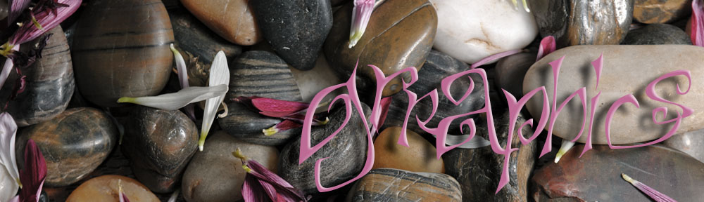
Here’s a color example, cropped from a piece based on Romans 13:8:
 I’m still looking for a good name for this letter family, and would welcome your thoughts.
