Lettering and calligraphy

I’m planning to talk about lettering, calligraphy, graphic design, and photography in this blog, so that begs the question “What’s the difference between lettering and calligraphy?” The distinction between the two isn’t always a bright line, but for most of my purposes, I usually say that calligraphy is written (by hand, of course), while “lettering” is a broader category including letters that are drawn and, in some cases, heavily retouched, either by hand or with the assistance of computer software such as Photoshop or Adobe Illustrator. “Calligraphy” means “beautiful writing,” according to its Greek origins. The notion of “beautiful” is of course open to debate, but to me, “writing” means that I make calligraphic letters with a sequence of strokes of a pen or a brush that allows me to construct each letter fairly quickly. But if I then scan that calligraphy, touch it up in Photoshop, and convert it to a vector graphic form so that I can enlarge it, distort it, and otherwise manipulate the letters, I’d say I’m getting into “lettering.”

Lettering may also just be letters drawn with a pencil, or letters drawn and then inked, or any number of other variations. Lettering may also get into font design, although that’s not currently one of my involvements.

Does any of this really matter? Only to the extent that it matters whether we understand each other. I’m not a purist about any of this. I have done a lot of studying of calligraphy and lettering and taken many workshops with some of the finest calligraphic and lettering artists in the world, but I don’t feel a strong need to put myself in a particular category. I just like creating designs that feature letters, and I usually try to make those letters unique and personal. Unless there’s a specific design reason for the letters to conform to a model, I don’t usually try to make my letters exactly like anyone else’s.

I’ll try to show more examples of personal lettering and calligraphy in some of the following posts.

Comfort and hope

My wife and I are leaders of an adult church school class called Seekers, and this year we asked the class to think about the question “What resources do you turn to in times of trouble?” The class responded by writing about hymns, scriptures, favorite quotations, and personal recollections, and we decided to make these writings into a book that our class members could have as a keepsake.

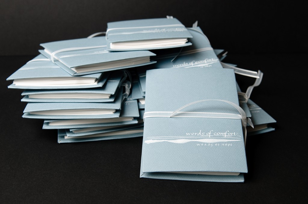
Never having done a book-making project, we thought we’d probably want to avoid a binding method that required stitching, so we settled on an accordian-fold binding. No calligraphy here except for the cover, as the entire book ran to more than 30 pages, and we needed to make about 15 copies. But I was still pleased with the way it came out – here’s the result:

Comfort and hope books

I learned a couple of things here – first, I did enjoy the bookmaking process. And second, making 15 copies of a book is really time-consuming! For those who like details, the covers were made from chipboard, covered with Canson paper and the cover was then painted and lettered with white gouache. The closure ribbon was inserted between the chipboard and cover paper for the back cover, and threaded through slots cut into the edge of that cover. I’m sure there are other solutions to making a closure – this is just the one we arrived at without knowing what we were doing.

I think Comfort and Hope would be a good theme for a calligraphic piece. What gives you comfort and hope? If you don’t want to comment publicly, please feel free to send me a private e-mail using the Contact page. Let me know, too, if you’d give me permission to use some of your words.

Graceful Envelopes

I spent some time yesterday looking over the results of this year’s Graceful Envelope contest. The winning envelope designs can be seen at http://calligraphersguild.org/envwinners2010.html

I was pleased to see that one of the adult winners this year was my old friend and fellow Cheerio calligraphy workshop attender, Julie Gray. Congratulations, Julie!

I thought this year’s entries were absolutely amazing – take a look for yourself and let me know what you think.

Zen flow

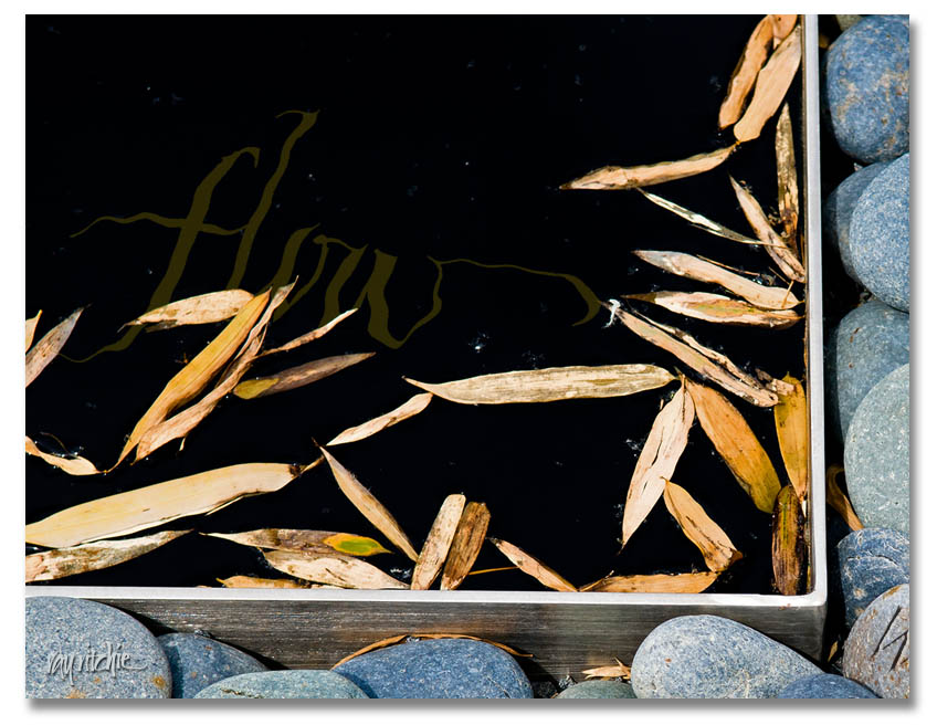
After some private feedback from a fellow member of cyberscribes (see my blogroll for a link), I was prompted to play around with the idea of having some text in the water of the “Zen stones” piece. This required a little re-thinking about the layering and filtering of the image and text in Photoshop, but here’s the result of the first experiment:

There would be multiple challenges with this idea. First, there’s the danger of losing the character of the calligraphy if I distort it too much with the Photoshop “Ripple” filter. Then there’s a technical detail issue: the Ripple filter is 8-bits, whereas I try to do all my image processing in 16-bit mode until I’m ready to publish or post. For reduced-size web images like I’m doing here, it will probably never matter, but in a 12×18 or larger print, there may be some small impact on quality. And most importantly, there’s the design issue of dominance. My feeling in combining text with photos is usually that “less is more;” in other words, I probably don’t want text too many places in the photo, so if I decide to incorporate, say, a quotation in the water, I’d probably want to limit myself to only a few words among the stones. Photos and text always compete with each other for dominance of the viewer’s attention, so I need to decide what amount of text (and what placement) is right for the overall feel of the piece. More food for thought.

Hopefully, I’ll eventually post a completed product for the Zen Stones piece. For now, I’ll probably just respond to comments, if any, and go on to another topic in the next post.

Image seeking word

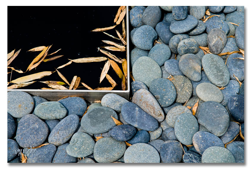
Sometimes I capture a photographic image that just seems to cry out for some words, but I don’t always know what words the image is seeking. Here’s an image I made at the reflecting pool in the courtyard of the North Carolina Museum of Art during a visit last April:

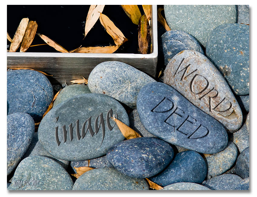
I loved the “Zen” feel of this photo, and have been thinking for several months now about how I could best use it with some text. One thought is to use some Photoshop trickery to paint or incise some words on the individual stones. With a little work with the Bevel and Emboss tools, it’s possible to make a pretty convincing fake. Here’s an example, just to give you an idea of what I’m talking about:

Maybe some of you might have ideas about a nice short quote or a set of words that would go well with this image. Please give me your comments!

By the way, if you’d like to make a quick virtual visit to the NCMoA, a set of my photos from my April visit is on my flickr stream here:

http://www.flickr.com/photos/21031876@N04/sets/72157624547570665/

Word and image

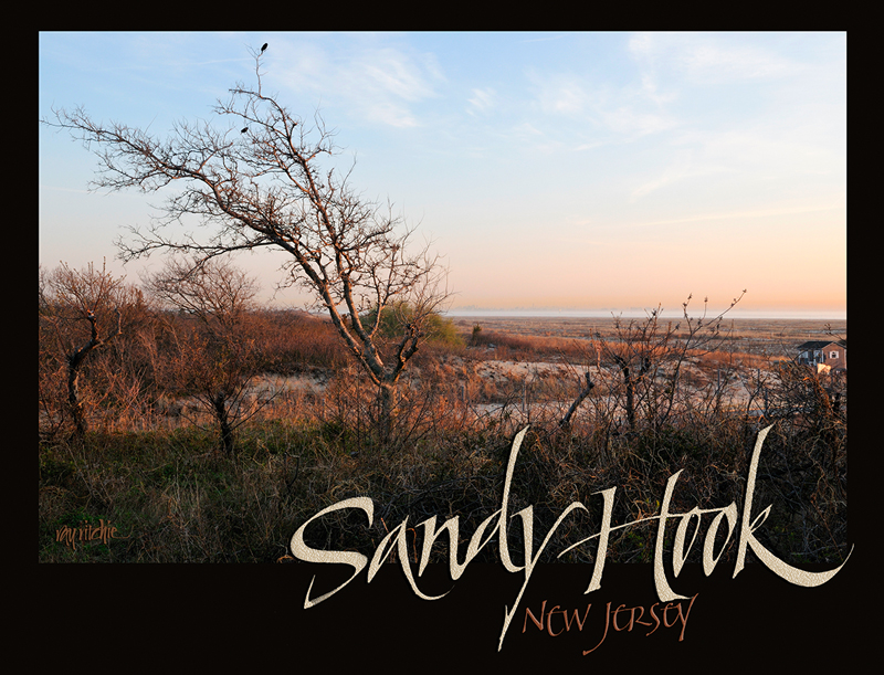
Classical calligraphy is frequently combined with some form of image or illustration. While I do some illustration, drawing, and painting, my most frequent form of imagery is digital photography, and I love to find ways to combine my words and photographic images into unified designs. Here’s an example:

This is a T-shirt design, based on a photograph I made at the Gateway National Recreational Area on Sandy Hook, New Jersey (for those in the know, the specific location is Gunnison Beach, the infamous “nude beach” – no nudes present when I made the photo in April, though). The text at the bottom is hand calligraphy, and was originally written in black ink on white paper. I scanned it into my Mac Pro, brought it into Photoshop, and changed the text color to match colors sampled from the photo. Finally, I added some “sand” texture to the words “Sandy Hook,” and layered the whole design up in Photoshop.

This design was published in the Annual Review issue of Letter Arts Review in the spring of 2010.

One small step

This blog will be a place to discuss lettering, calligraphy, graphic design and photography, as these are the areas that I work in and enjoy in my small business, Ray Ritchie Design LLC.

I’ve had good intentions for years now of totally re-building my website, but that project keeps getting put off because of the hurdle of learning new software (my site was originally built in Adobe Golive, which is no longer a supported product). I hope to use this blog as a means of frequently posting some new, fresh material, and then just take down the old site and replace it by something which will be more professional and initially, much slimmer. Over time, I’ll then start adding to the galleries there and introducing a photography gallery to complement the calligraphy and lettering work.

In the meantime, please bear with me as I learn to use WordPress. I’ll be playing around extensively with the look and feel of the blog as I learn the capabilities of this software.