Home from Italy

We just returned last night from a great two-week trip to Italy with several members of my family, so it’s time to start sharing some of my results with the new D800. For this trip I was using a Nikon 24-85 f/3.5-4.5 VR lens, which I purchased specifically as a “travel” lens, to give me a lighter-weight option compared to other lenses I expect to use on this camera for a lot of my landscape work, and I was anxious to see how it would perform and to begin learning the unique quirks of both the lens and the camera.

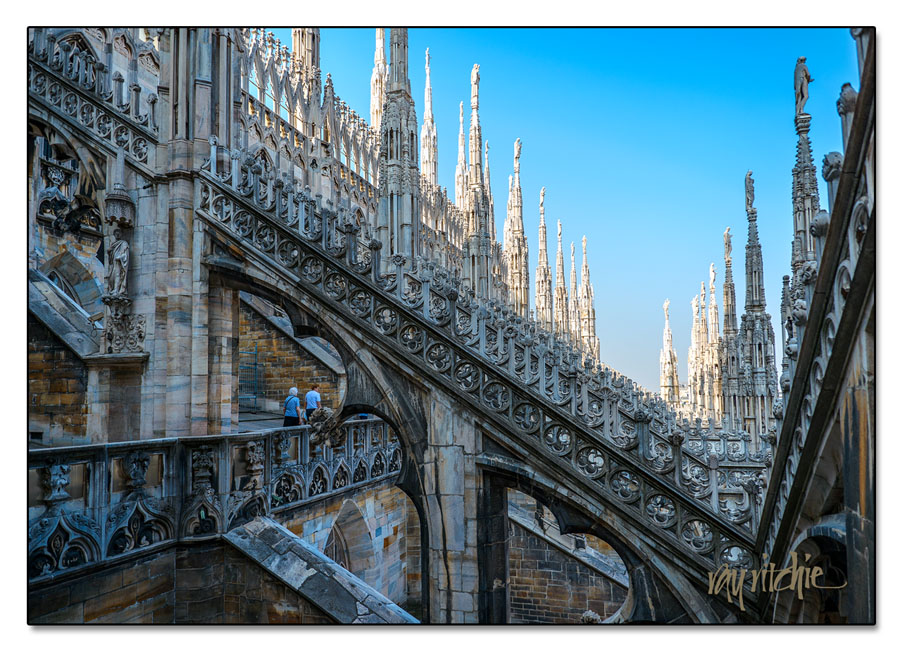
I expect I’ll post more images from the trip later, but for today, I’ll just share three. First, from Milan, where we got to explore the terraces of the ornate Duomo:

Technical data: f/4.5, ISO 100, 1/400 sec., and 24mm.

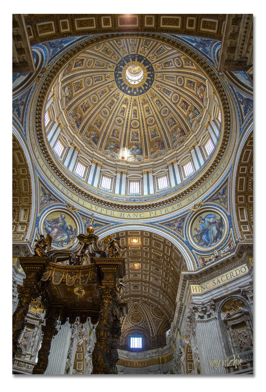
From Rome, inside the Basilica of St. Peter:

Technical data: f/4.5, ISO 1600, 1/30 sec., and 24 mm.

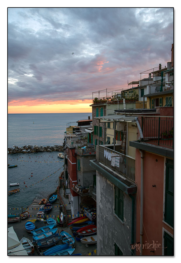
And from Riomaggiore, in the Cinque Terre region:

Technical data: f/7.1, ISO 320, 1/25 sec., and 31mm.

All of the images above were initially developed in Adobe Lightroom 4, and further processed in Photoshop CS5.1.

Just to give a quick comment on the new 24-85 VR lens, which is definitely the weaker link in this camera/ lens combination: I’ve been very impressed with what it can do. The most obvious weaknesses so far are distortion, especially at the extreme wide and telephoto ends of the zoom range, and softness in the edges and corners in some situations. But the lens is quite sharp at most focal lengths, focus distances, and apertures, and the vibration reduction (VR) works very effectively. The distortion is mostly correctable in post-processing, and I’ll eventually be able to do that automatically once I get an appropriate “profile” in place in Lightroom.

As for the camera, I am finding that the files are a joy to work with, in that they can be pushed a lot in post-processing, and I’m loving the results I get. The overall weakest link in my photography gear is me; but hopefully, I’ll improve as I get to know the equipment better. I’m looking forward to doing more shooting from a tripod (I didn’t have one with me in Italy), where I’ll be forced to work a little slower and more carefully than I’ve done with most of my D800 images so far, which have been done 90% with hand-held shooting.

A larger set of images from Italy can be found here .

Sunflower Serendipity

Late August to early October or so is usually sunflower season in New Jersey, and there are often large fields of these huge flowers in the more rural areas of our county. This year, though, I noted with pleasure that one of the local farmers had planted sunflowers in a field normally used for raising sod grass, right on the road into Freehold, just in front of a former glass factory which is now used as a document storage and destruction facility. The owners of the field have planted a mix of sunflowers and various wildflowers, and the overall effect is spectacular.

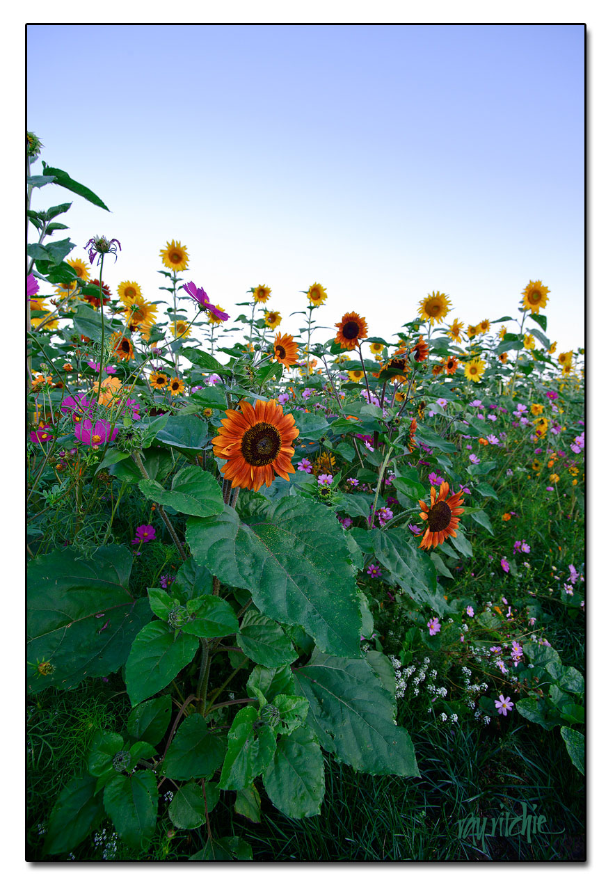
Since I finally broke down two weeks ago and bought the Nikon D800 that I’ve been lusting after since February, I decided the sunflower field would make a great test subject. So I got myself out of bed before sunrise, and headed over to the field with the new camera with a couple of my lenses, just to see how each would perform on the D800. I was very pleased with the results, given that I don’t yet have enough experience to understand what lens to use when on this new tool, or whether I may yet need to purchase one or more additional new lenses to take full advantage of the 36 megapixel resolution (that’s three times the number of pixels of my D300, or about 80% higher resolution). I’m pretty sure the answer to that last question is “yes.” But since there have been so many Internet posts talking about how the D800 demands absolutely top-rated (i. e., expensive) glass, I was pleasantly surprised to see how well my 7-year old Tamron 17-35mm lens (probably worth about $250 on the used market) performs. Here’s an example from the morning shoot:

For those who care about such things, the image above was shot at f/7.1, 17mm, ISO 100, and 1/6 second, in Nikon’s raw NEF format, developed in Adobe Lightroom 4, and given some final touches in Photoshop 5.1.

I’ve been giving the D800, the Tamron, and a new lightweight “travel” lens (the Nikon 24-85 f/3.5-4.5 VR) a shakedown in Italy for about a week now, and will start posting photos from that series after I return home. But so far, I really love the new camera, and I’m really happy I went ahead and got it in time for this trip. And I’m delighted that I had these sunflowers available as my first subject.

Vacation for plants

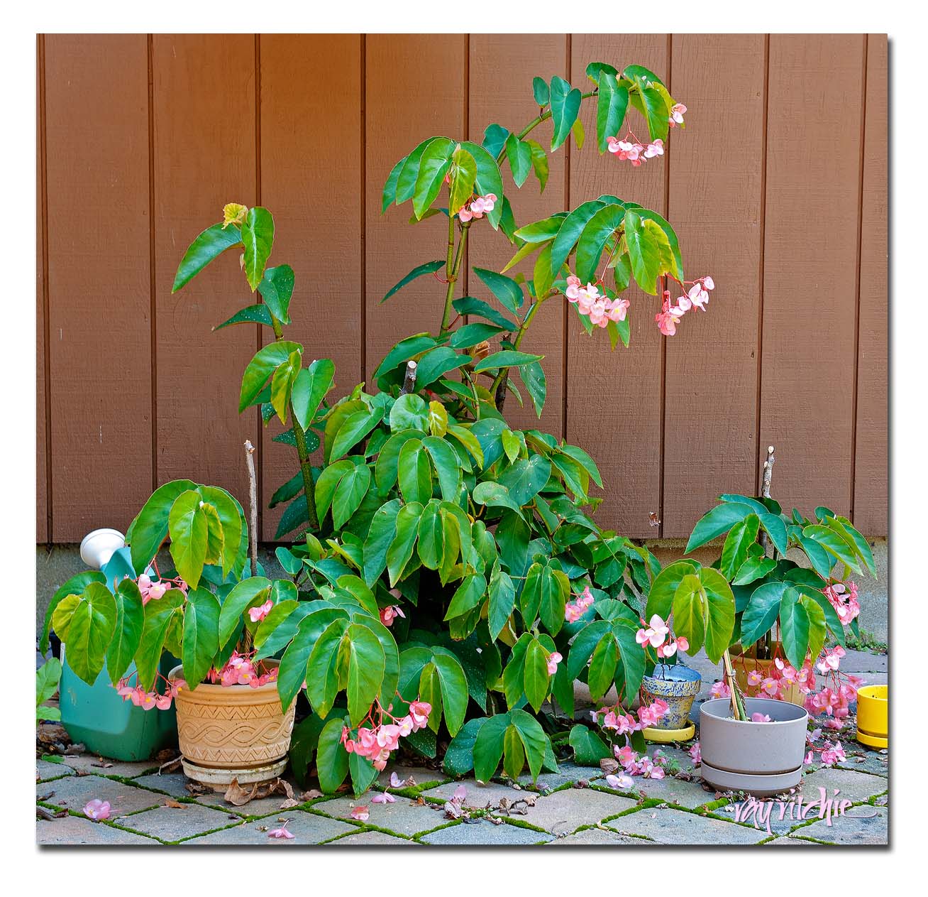
My mother’s angel wing begonia, which we brought home after her passing last year, has really been enjoying its summer vacation on our patio. The plant was not in very good shape when we brought it home, but I went on a campaign of feeding, watering and pruning, and this year it has begun to flourish. We moved it from the sunspace to the patio for the summer months, and the extra sun and all the rainy weather seem to agree with it. During the winter I started propagating some cuttings, which are also developing into nice plants, and now all of the begonias are bursting with blooms:

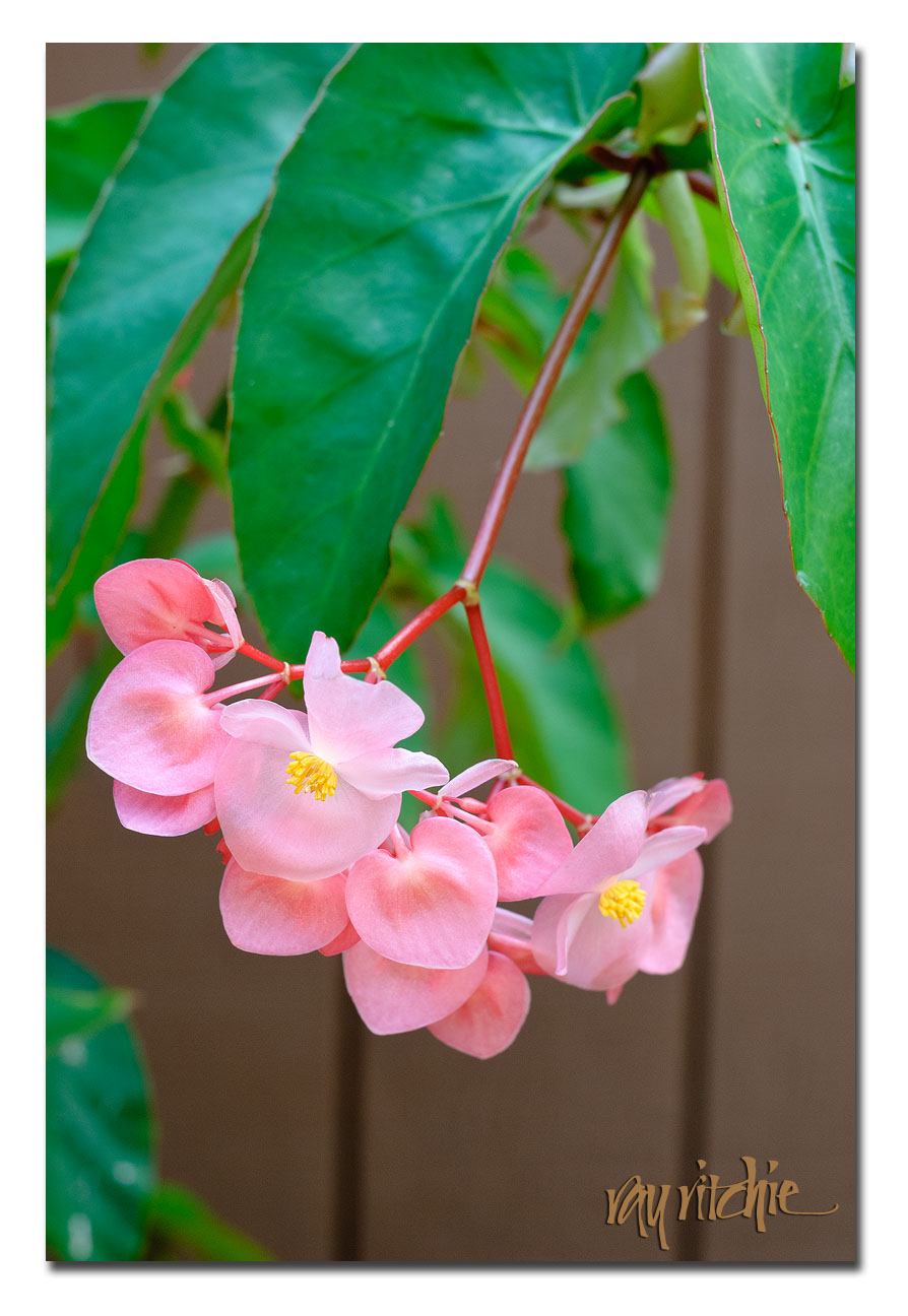
I don’t know if Mom ever had so many blooms on this plant – but I do know that I never visited her when it had more than one or two. I probably need to cut it down some before its vacation is over and we return it to the sunspace, but it’s doing so well now that I hated to disturb it much. I love the delicacy of the blooms, which are so thin that they’re actually a little translucent.

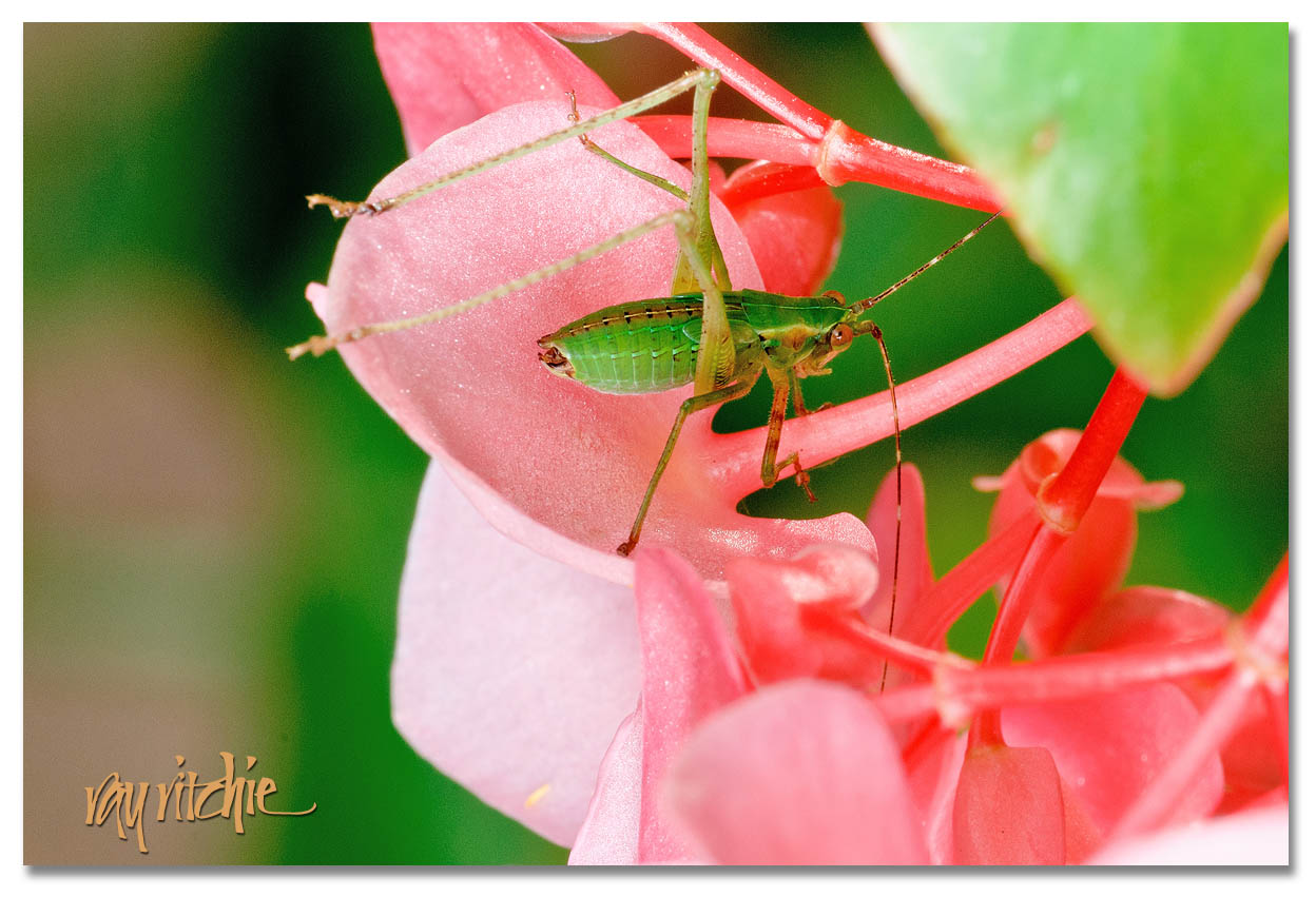
Apparently, the insects love the begonia blooms, too – yesterday I found this little guy hanging out:

I thought of Mom this morning in church as we were singing “Shall We Gather at the River,” and had a hard time continuing to sing for a verse or two. I think she would have enjoyed seeing her begonia in such good shape – we’re certainly enjoying it, and cherish it as a reminder of her.

10 years of digital – Part 3

At roughly this time of year in 2003, Anita and I made a memorable trip to Yellowstone and Grand Teton National Parks. We arrived in Salt Lake City the week before Memorial Day, rented a car, and spent a week in Yellowstone and about four days in Grand Teton. This was the first big trip I made with my Nikon D100 DSLR, and it was a great learning experience for me as a photographer. Looking back through my photo files now, it’s disappointing to me to see how few of the images I still consider “good,” but I do find that many of them are at least “good enough,” in that they can be rescued with a little Photoshop magic. Once I start going back through my old photos, it’s hard to know where to stop, but I’ll only share a few in this post.

One of the great things about a late May trip to Yellowstone is that you arrive just as the full park is opening, and you get to experience some of the remnants of winter while the weather is mostly spring/ summer. During the winter, the only access to the park is via the Mammoth Hot Springs entrance, in the northwest corner of the park, and the rest of the park is only reachable via snowcat, snowmobile, or via cross-country skiing and/ or snowshoe trekking. But in May, the park roads are finally plowed (though the mountain pass roads still have 12-foot high snowbanks at roadside), and the lodging throughout the park begins to open as they train the staff for the summer, opening a new facility every few days. Crowds are relatively light for Yellowstone during this period, and because the staff is being trained, the hotels offer discount rates.

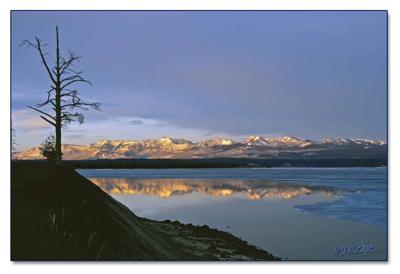
With the discounts, we decided we could treat ourselves to staying at the Yellowstone Lake Inn, which is one of the more elegant park lodgings. We arrived there late in the day, having just spent a full day in the park after entering from the town of West Yellowstone. All day we had been surprised by the amount of snow remaining in the park, and we found the lake still partially frozen:

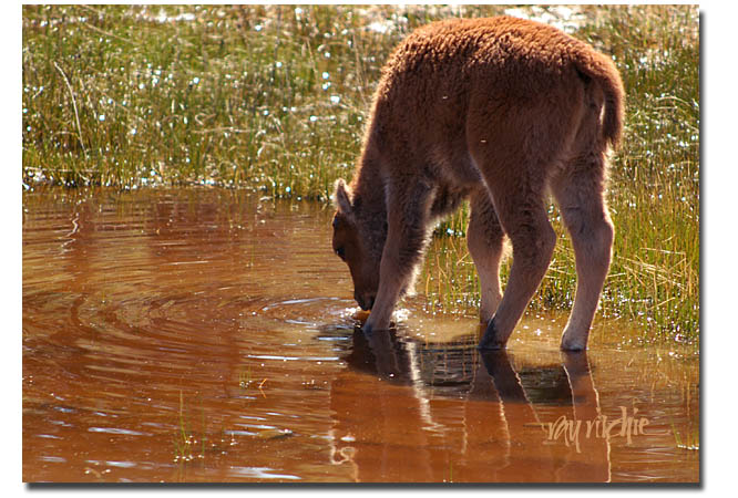
I have to mention one other great feature of Yellowstone in the late spring, and that is that this is the time when the young animals are born. We found this calf drinking beside the road as all vehicle traffic stopped to let a bison herd cross the pavement:

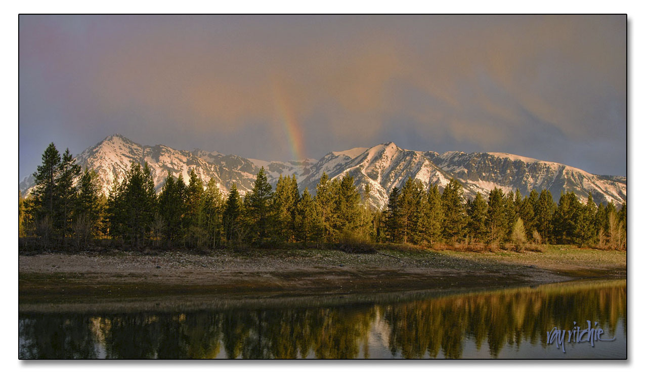
After our week of enjoying the wildlife, the geysers, hot springs, and wild expanses of Yellowstone, we moved down from the mountains into the Jackson Hole area at the foot of the Grand Teton range, and rented a small cabin at Colter Bay. The first morning, I got up before sunrise, so that I could be at lakeside when the sun came up. I was lucky to catch, not only the sunrise, but a rainbow as well:

When I go back to these old files, I’m reminded of one of the main reasons why I love photography so much. Often these days I feel my age, and am distressed at how little my mind still seems to retain from my past experiences. But when I look at that picture, I can still remember our little log cabin, with its painted “headboards” for the beds on the interior walls. I remember waking to the birds singing, walking the trail down to the lake in the semi-darkness, setting up the tripod on the gravel of the lakeside beach – a whole stream of memory comes back to me, and I know it’s all in there somewhere, if I can just find the key to unlock it.

My only other trip to this area happened when I was about twelve, as my family made a month-long camping trip across the country and back, hitting as many National Parks as possible in 30 days. Compared to that trip, this one was a real in-depth immersion. But as I tap into my memories through these photos,  I realize that I could return to either of these parks a dozen times and never feel I had experienced everything they have to offer.

African masks and Illuminated Letters

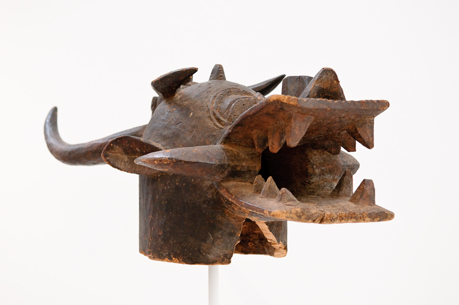
A couple of years ago, I had a chance to see a remarkable collection of African art, both ancient and contemporary, at the North Carolina Museum of Art. Among the treasures exhibited was a collection of African masks. I have photos of a number of these, but I’ll just show one here, so that you know what I’m talking about:

I had never done anything with these photos, other than share them with friends, as the NCMoA, like many museums, puts a condition on its photography permission that any photos taken must be “for personal use only.” But last week Anita was making a card for relatives with a new baby, and she chose a jungle animal theme. As usual, the task of designing the envelope fell to me, and I happened to remember my African mask photos, and wondered if I might find some material there for an envelope design. As I studied the photos, and the wonderful abstract representations of creatures real and imagined, I was reminded of the ornamental “beasties” used in Celtic art, and I started thinking about writing the family name in a set of illuminated letters based on some of the masks and other art objects in the exhibit.

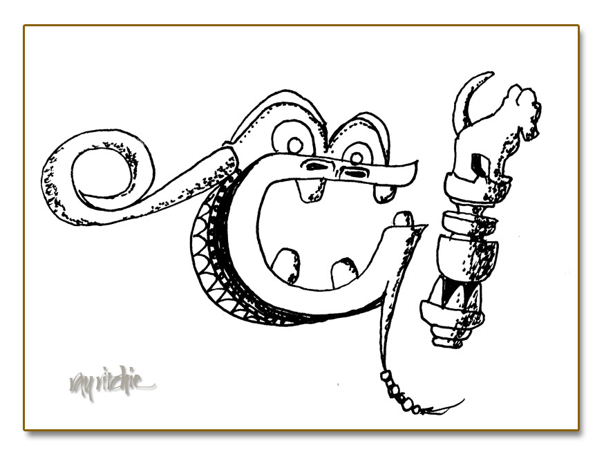
For a variety of reasons (basically because the idea was too obscure and complex), I ended up discarding the idea, but not before I had made some initial sketches. The family name began with a “G” and an “I” (the family members, if they’re reading, will now recognize themselves). Here was my sketch for those first two letters:

The “G” in the sketch above isn’t really a direct representation of any of the masks in the exhibit, but it grew out of studying the photo shown at the beginning of this post. The “I” is a direct sketch of one of the carved staffs exhibited. Even though I didn’t use the idea this time, I think it has potential for the future. I have more than a dozen photos from the exhibit as a starting point for source material, and I’m sure that a Google for “African masks” would yield many more. Reduced to line drawings, these designs start to echo strongly of the Celtic artwork of the Book of Kells and other classic works.  Here’s a quick poster design showing three more sketches, without trying to use them as letters:

The mask in the lower left has obvious potential as an “H” or perhaps an “X”, and the others could easily be used as a part of almost any letter with an open bowl, such as an “O” or a “Q.” The upper right mask might also be a part of an “R,” or perhaps a lower case “A.” Now I just need another twenty or so sketches, and I’ll have a complete alphabet… If you have links to other African mask sketches or photos, I’d appreciate hearing from you.

The best camera

There’s a lot of less-than-valuable and less-than-accurate information on the Internet, but occasionally, some of the overused online quips contain real wisdom. On the photography forums that I follow, one of the most commonly repeated lines is “The best camera is the one you have with you.” As I mentioned in my previous post, I’ve been suffering from New Camera Acquisition Syndrome, but in the meantime, the camera I have with me is the Nikon D300, on which I usually have my 17-55mm Nikkor f/2.8 zoom lens mounted. This setup has been my most frequently-used camera and lens for about four and a half years now, and it has provided me with a lot of enjoyment, and here and there, a little revenue. But nothing I’ve gotten from this gear has meant as much to me as the photos I’ve shot since I became a grandfather last summer.

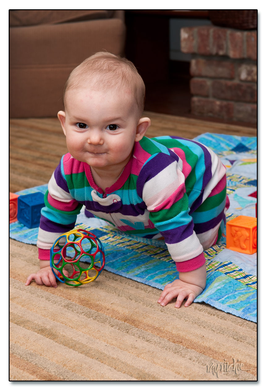
Our granddaughter, Anna, is now 9 months old, and was here for a visit last week, along with her parents and her Czech grandfather, so of course her American grandfather had the camera out constantly. Here’s one of my favorite shots from the visit:

I’ve never considered myself a “people” photographer, but Anna has been making me want to learn. She has a wonderfully expressive face, and changes each time we see her. She just started crawling recently, and now has to be watched every minute – which is a good excuse to take more photos, since we have to be watching her all the time anyway. And Anita and I now have iPhones full of baby pictures – the modern grandparents’ “brag book.”

Any camera I own someday in the future will have a hard time giving me the pleasure that I’ve already experienced by photographing her with the camera I have.

[Technical notes: Shot at f/6.3 and 55mm, ISO 200, with my 17-55 zoom and flash lighting. The flash was a single SB-800, mounted on the camera with a miniature "softbox" to diffuse the light, and aimed about 60 degrees upward, so that a portion of the light was reflected from the ceiling. I was having some troubles with my flash due to having inadvertently set the flash to the wrong mode, so the shot was underexposed by about one f-stop, and compensated in postprocessing in Lightroom 3 and Photoshop CS5.1. I also used Photoshop to darken and slightly blur the background, and to sharpen and enhance the brown in Anna's eyes, and finally, I removed a number of small scratches she had inflicted on herself with her fingernails as she slept]

Spring fever and new camera antidote

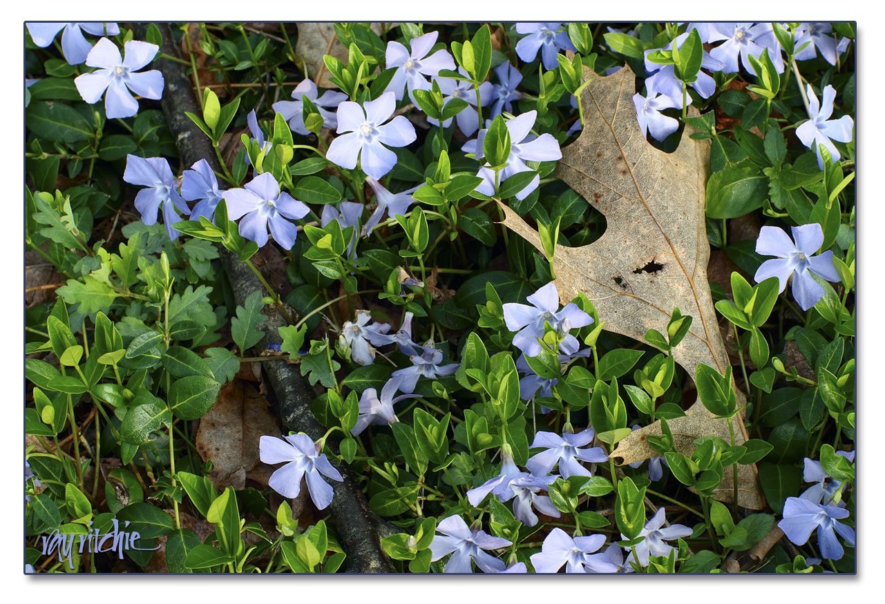
One of the things I always look forward to at this time of year is the emergence of the periwinkles from the dead leaves, branches, and miscellaneous winter detritus beside our driveway entrance. I’ve photographed the scene several times before, but this week I really felt the need to shoot it again. Nikon announced a new, super-high resolution camera (the D800 – a 36 megapixel “full-frame” model) last month.  I had been successfully resisting the tug of such a major purchase, but this week the first copies started arriving to their new owners all over the world, and the flood of resulting images has really started my photographic salivary juices flowing. I decided that perhaps the best antidote would be to shoot more with the equipment I already have. Here’s one of this morning’s shots:

Shot with my Nikon D300 and 50mm f/1.8 lens, f/11 and 1/20 second at ISO 200. If you right-click on the image and choose “Open image in new window,” you can see enlarge the image so that you can see some of the finer details. As you will know if you follow this blog, I love this sort of detailed nature shot – I discover some new feature every time I look at it. And for now, it has slaked my new camera passion enough that I can probably get through the weekend without ordering the D800. Ask me next month whether I’m still managing to resist.


Hamilton Watch Font

One of the hazards of being interested in lettering is that you sometimes find yourself looking more at form than content. We recently went to see the movie The Descendants, and during the opening credits I found myself looking at the form of the lettering and the backgrounds, and asking myself “How would I do that?” I have no idea what the credits actually said.

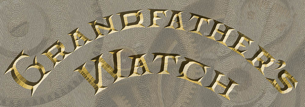
Similarly, when I was doing my recent post about my grandfather’s watch, I kept looking at the engraved lettering on the works of the watch and wondering “What does that alphabet look like?” and “What can it be used for?” You can see part of the lettering in the photo montage in the previous post – the full text on the case reads “Hamilton Watch Co., Lancaster PA., 21 Jewels.” Just for grins, I made a sketch of the letters one evening a week or two ago, and then started to imagine what some of  the missing letters of the alphabet might look like. Here’s a quickie Photoshop composition based on one of my sketches:

I started out by just sketching the letters above as black outlines. After scanning them into Photoshop, I filled them in with a solid color, and then touched up the edges to remove some of my pen bobbles and other irregularities. I then added the beveled debossed effect as a Layer Style, and generated a wavy background pattern to echo the fancy decorative milling on the actual watch works (again, you can see the authentic decorative milling patterns in my original post). Finally, just to add a little more interest and texture, I layered in one of my closeup photos of the actual watch.

As with many of the things I show on this blog, I don’t have any immediate application for this lettering, but I think the font could be useful someday as a titling font when I want something that suggests antiques. I’d have to clean it up, of course, but that is pretty straightforward to do (though tedious) using the vector drawing capabilities of either Photoshop or Adobe Illustrator. Here’s an example of what the letters look like when I start to clean up my sketches a little:

If I were really going to develop the full font, I’d need to look carefully at all the letter proportions relative to each other – that “D” looks a little wide to me right now compared to the “R,” for example – and I’d have to figure out the full set of decorative caps, as well as the lower case letters; but I may do it, if I find the right project that calls for an old-fashioned feel to the text. Can you think of any applications for these letters? I’d love to hear from you.

Before and after: photo restoration

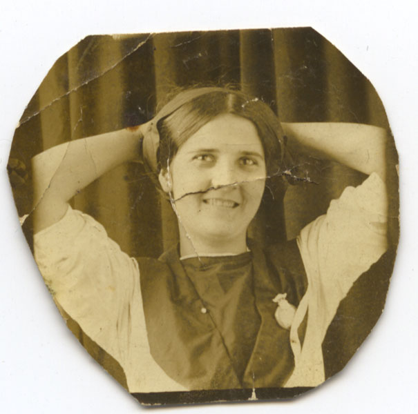
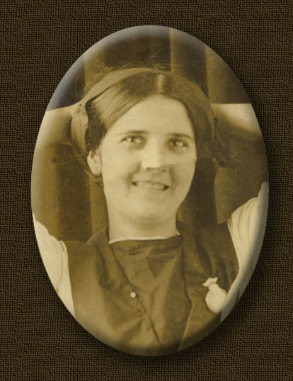
In my earlier post about my grandfather’s watch, I promised to make a future post showing the “before and after” of my photo restoration work on Grandma Bourne’s picture. My purpose here is not to give a detailed “how to,” but simply to give an illustration of what’s possible these days, as this photo was one of the most badly damaged pieces that I’ve ever worked on. Here’s what the photo looked like when it fell out of the watch:

As you can see, Grandma suffered a lot from 90 or so years in the back of Granddaddy’s watch. That photograph has just about all the impairments you’re likely to encounter in restoring old photos: foxing (the brown stains), scratches, bends, wrinkles, and rips. But as I discussed earlier, it was a unique photo, in that it showed my grandmother as young, smiling, and playful – a totally different view than any of the other family photographs I’d ever seen. Grandma worked for the Post Office in Washington, D. C. for a couple of years around the WWI timeframe, and I’m guessing this photograph was probably done during that period.

Photoshop CS5, which I am currently using, has several tools which help in this kind of work. The Healing Brush can be used to paint across blemishes – it looks at surrounding areas of the photo and replaces the painted-over area with a sort of average of the surrounding area. The Clone Stamp can be used to copy a texture from any arbitrary location; you can then “paint” with that copied area onto any other area; areas larger than the copied area will be painted with a repeating pattern. Both the Healing Brush and the Clone Stamp have been around for a long time, and have appeared in many past versions of Photoshop. New in CS5, though, is a tool called “Content Aware Fill.” WIth this tool, you can select an area of the image, hit “Delete,” and then choose from several options as to how to fill in the deleted area. One of these is “Content Aware,” which looks at the surrounding area and tries to make a good guess as to what the area being deleted should contain if it’s to look consistent with the rest of the image.

The Healing Brush is particularly effective on small blemishes surrounded by relatively smooth, undamaged areas – for example, it’s great at replacing a small scratch on the background curtain, or a pimple on an otherwise beautiful face. The Clone Stamp is good for working with areas that have some kind of texture, provided the area to be replaced isn’t too large (the pattern repetition of the Clone Stamp gets to be noticeable once the painted-over area becomes a lot larger than the original sampled area).  Content Aware Fill can be almost magical, but particularly when working with portraits, it also has its hazards – you can easily end up giving a person a third eye or an extra nostril, or hair in the middle of their cheeks, if you’re not careful.

The key in doing this restoration work is just to work patiently, trying the various tools to see which works for each blemish, and using the History palette when necessary to back up to the previous state when something unexpected and unacceptable happens. Careful adjustment of the brush size (for the first two tools) and the selected area can make a huge difference in the result.

I used all three tools in working on this particular image. Because the edges of the photo were irregular, and partially cut off her arms anyway, I decided to crop the final restored image into an oval shape. After giving it a Bevel and Emboss effect to simulate a cameo, and a drop shadow to emphasize the 3-D effect, and a textured background, it came out like this:

You can still see things wrong that I could work on further if I chose to, such as changes to the tone of the skin of the face and neck, due to folds and wrinkles in the original that made the light from my scanner hit different areas from a different angle. But I usually stop on restoring old photos before everything has been smoothed away – I want the image to still look old. I’m happy with this result.

It’s still only a small image: the original was only a little bigger than an inch across, and this final version came out to something I could probably print at about twice the original size. My experience in scanning old prints tells me that it’s seldom worthwhile to try to print a copy bigger than 1-2 times the size of the original. But it’s a new addition to the family archives, and from my point of view, it was definitely worth the effort.


You never know what you’ll get

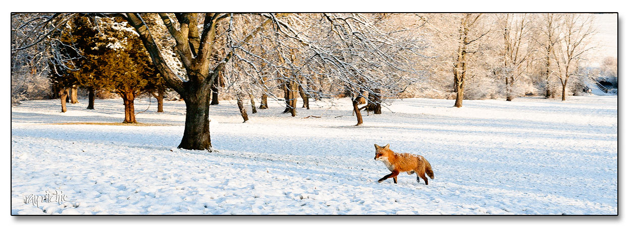
I really didn’t have Forrest Gump in mind when I wrote that title line. We had a light dusting of snow last night, and since there has been so little snow this winter, I decided I needed to make an early morning photo trek at Monmouth Battlefield State Park. I had my tripod set up on the hillside, overlooking the battlefield and the apple orchards, and was staring intently through my viewfinder framing the scene, when suddenly a red fox appeared, walking through my shot. Foxes aren’t really rare in our area, but I’ve probably only seen them four or five times in the last 30 years here, so this was pretty exciting for me. Unfortunately, I had the camera set up for a landscape shot, rather than wildlife, and I only managed to get off two shots before he saw me and ran away. Great light, but not a very sharp image due to the slow shutter speed, so I decided to make it more useable by giving it a drybrush painting effect. Click the image for a larger view.

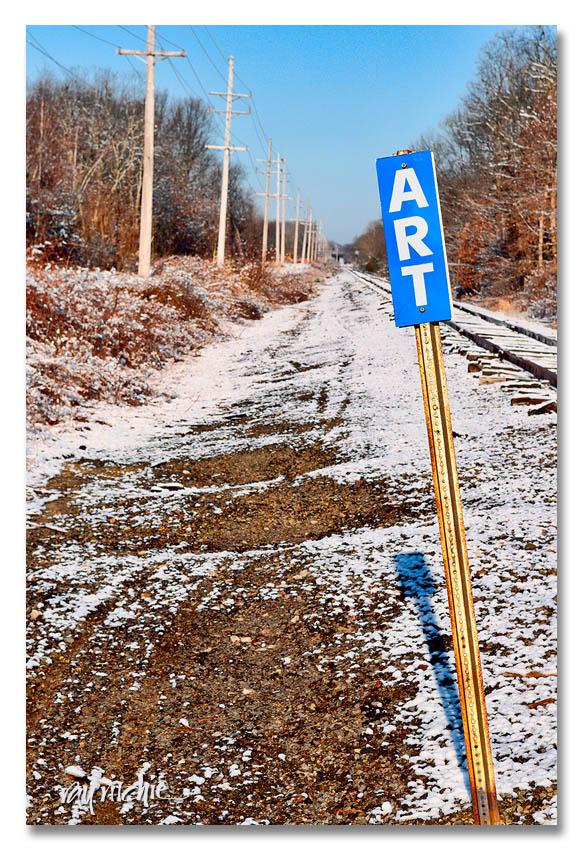
Here’s another shot from the same trip:

You know it’s art, because the sign says so.