From the sketchbook – maybe a poster someday?
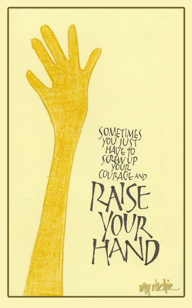
Let me know what you think.
From the sketchbook – maybe a poster someday?
Let me know what you think.
Our granddaughter, Anna, just turned one last week, and we went up for an extended weekend to join in the celebration. Anita thought Anna would need a special shirt to mark the occasion, so she found a plain white ruffled blouse and asked me to decorate it with some appropriately celebratory lettering. Here’s the finished product:

Anna probably doesn’t appreciate the words – but her parents seemed to like it, and Anna put on a nice display of cuteness for us while wearing it, so I’ll choose to think she liked it, too.
At roughly this time of year in 2003, Anita and I made a memorable trip to Yellowstone and Grand Teton National Parks. We arrived in Salt Lake City the week before Memorial Day, rented a car, and spent a week in Yellowstone and about four days in Grand Teton. This was the first big trip I made with my Nikon D100 DSLR, and it was a great learning experience for me as a photographer. Looking back through my photo files now, it’s disappointing to me to see how few of the images I still consider “good,” but I do find that many of them are at least “good enough,” in that they can be rescued with a little Photoshop magic. Once I start going back through my old photos, it’s hard to know where to stop, but I’ll only share a few in this post.
One of the great things about a late May trip to Yellowstone is that you arrive just as the full park is opening, and you get to experience some of the remnants of winter while the weather is mostly spring/ summer. During the winter, the only access to the park is via the Mammoth Hot Springs entrance, in the northwest corner of the park, and the rest of the park is only reachable via snowcat, snowmobile, or via cross-country skiing and/ or snowshoe trekking. But in May, the park roads are finally plowed (though the mountain pass roads still have 12-foot high snowbanks at roadside), and the lodging throughout the park begins to open as they train the staff for the summer, opening a new facility every few days. Crowds are relatively light for Yellowstone during this period, and because the staff is being trained, the hotels offer discount rates.
With the discounts, we decided we could treat ourselves to staying at the Yellowstone Lake Inn, which is one of the more elegant park lodgings. We arrived there late in the day, having just spent a full day in the park after entering from the town of West Yellowstone. All day we had been surprised by the amount of snow remaining in the park, and we found the lake still partially frozen:

I have to mention one other great feature of Yellowstone in the late spring, and that is that this is the time when the young animals are born. We found this calf drinking beside the road as all vehicle traffic stopped to let a bison herd cross the pavement:

After our week of enjoying the wildlife, the geysers, hot springs, and wild expanses of Yellowstone, we moved down from the mountains into the Jackson Hole area at the foot of the Grand Teton range, and rented a small cabin at Colter Bay. The first morning, I got up before sunrise, so that I could be at lakeside when the sun came up. I was lucky to catch, not only the sunrise, but a rainbow as well:

When I go back to these old files, I’m reminded of one of the main reasons why I love photography so much. Often these days I feel my age, and am distressed at how little my mind still seems to retain from my past experiences. But when I look at that picture, I can still remember our little log cabin, with its painted “headboards” for the beds on the interior walls. I remember waking to the birds singing, walking the trail down to the lake in the semi-darkness, setting up the tripod on the gravel of the lakeside beach – a whole stream of memory comes back to me, and I know it’s all in there somewhere, if I can just find the key to unlock it.
My only other trip to this area happened when I was about twelve, as my family made a month-long camping trip across the country and back, hitting as many National Parks as possible in 30 days. Compared to that trip, this one was a real in-depth immersion. But as I tap into my memories through these photos, I realize that I could return to either of these parks a dozen times and never feel I had experienced everything they have to offer.
I haven’t done much finished calligraphic work for awhile, but Anita’s constant flow of cards always require envelope addressing, and that keeps me somewhat in practice. Here’s a recent sampling of three names with different treatments:

These envelopes are almost always done with brush markers and/ or fine Zig Micron pens. I enjoy doing them because they give me a chance to experiment with lots of different styles and ideas. The color and decoration scheme usually take their cue from the card design, and the letterforms are sometimes related to the forms used on the card, if I like the style. In the three cases above, Kathy’s envelope has letters that are my own design and unrelated to the card, but the decorative floral treatment is a take-off related to the card design. Martin’s envelope has lettering similar to that on the card, but I’ve changed the weight of the monoline forms, and added tilts and curves that weren’t in the typeface on the card. The cherry over the “i” in “Martin” is from the card design. Evelyn’s color scheme is the same as the card, and the small flower at the end of her name is related to the card design, but the letterforms themselves are my own, and are completely different from the card lettering.
My general rule with these kinds of envelopes is that I put my emphasis on color and design, but don’t try to hold myself to a “finished art” standard, as that would probably at least double the time required. I try to push myself to try something new as often as possible, but I do find that I develop certain formulas that I like and I re-use them fairly often, especially when I’m faced with a stack of cards that need to go out quickly. I rarely take the cards to my drawing board in my office/ studio, but usually just do them on a lapboard in the den. I only allow “do-overs” when I make an irretrievable error, so some of my envelopes please me much less than others – luckily, though, my audience for these is pretty uncritical and appreciative.
Since the previous post, I’ve played around a bit with constructing various illuminated letters. As I indicated in the first sketch of the previous post, I originally was thinking of using these designs as stand-alone letters in an informal envelope design, and I still think that’s probably the way I’d most likely use them. But I can conceive also of using the masks and other African art designs to decorate an initial letter of a block of typeset text or classically lettered calligraphy. In this case, we might want to superimpose the art design on top of a simple, strong form, to avoid competition between the complex details of the artwork and the lines of the letter – maybe something like this:

Obviously, we could use other letterforms for the background capital – uncial, classical Roman, a modern Versal form, etc. – the form above is just an example.
Yesterday I got into sketching more of the African art designs based on photographs in my library – here’s the collection so far:

I’ve got a few more photos in my library yet to sketch, and then I need to find some more sources. A friend mentioned to me yesterday that she has a collection of African art objects in her home, so I’ll try to arrange to take a look at that in the near future.
A couple of years ago, I had a chance to see a remarkable collection of African art, both ancient and contemporary, at the North Carolina Museum of Art. Among the treasures exhibited was a collection of African masks. I have photos of a number of these, but I’ll just show one here, so that you know what I’m talking about:

I had never done anything with these photos, other than share them with friends, as the NCMoA, like many museums, puts a condition on its photography permission that any photos taken must be “for personal use only.” But last week Anita was making a card for relatives with a new baby, and she chose a jungle animal theme. As usual, the task of designing the envelope fell to me, and I happened to remember my African mask photos, and wondered if I might find some material there for an envelope design. As I studied the photos, and the wonderful abstract representations of creatures real and imagined, I was reminded of the ornamental “beasties” used in Celtic art, and I started thinking about writing the family name in a set of illuminated letters based on some of the masks and other art objects in the exhibit.
For a variety of reasons (basically because the idea was too obscure and complex), I ended up discarding the idea, but not before I had made some initial sketches. The family name began with a “G” and an “I” (the family members, if they’re reading, will now recognize themselves). Here was my sketch for those first two letters:

The “G” in the sketch above isn’t really a direct representation of any of the masks in the exhibit, but it grew out of studying the photo shown at the beginning of this post. The “I” is a direct sketch of one of the carved staffs exhibited. Even though I didn’t use the idea this time, I think it has potential for the future. I have more than a dozen photos from the exhibit as a starting point for source material, and I’m sure that a Google for “African masks” would yield many more. Reduced to line drawings, these designs start to echo strongly of the Celtic artwork of the Book of Kells and other classic works. Here’s a quick poster design showing three more sketches, without trying to use them as letters:

The mask in the lower left has obvious potential as an “H” or perhaps an “X”, and the others could easily be used as a part of almost any letter with an open bowl, such as an “O” or a “Q.” The upper right mask might also be a part of an “R,” or perhaps a lower case “A.” Now I just need another twenty or so sketches, and I’ll have a complete alphabet… If you have links to other African mask sketches or photos, I’d appreciate hearing from you.
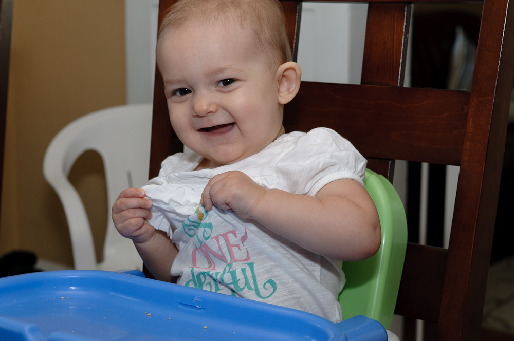
There’s a lot of less-than-valuable and less-than-accurate information on the Internet, but occasionally, some of the overused online quips contain real wisdom. On the photography forums that I follow, one of the most commonly repeated lines is “The best camera is the one you have with you.” As I mentioned in my previous post, I’ve been suffering from New Camera Acquisition Syndrome, but in the meantime, the camera I have with me is the Nikon D300, on which I usually have my 17-55mm Nikkor f/2.8 zoom lens mounted. This setup has been my most frequently-used camera and lens for about four and a half years now, and it has provided me with a lot of enjoyment, and here and there, a little revenue. But nothing I’ve gotten from this gear has meant as much to me as the photos I’ve shot since I became a grandfather last summer.
Our granddaughter, Anna, is now 9 months old, and was here for a visit last week, along with her parents and her Czech grandfather, so of course her American grandfather had the camera out constantly. Here’s one of my favorite shots from the visit:

I’ve never considered myself a “people” photographer, but Anna has been making me want to learn. She has a wonderfully expressive face, and changes each time we see her. She just started crawling recently, and now has to be watched every minute – which is a good excuse to take more photos, since we have to be watching her all the time anyway. And Anita and I now have iPhones full of baby pictures – the modern grandparents’ “brag book.”
Any camera I own someday in the future will have a hard time giving me the pleasure that I’ve already experienced by photographing her with the camera I have.
[Technical notes: Shot at f/6.3 and 55mm, ISO 200, with my 17-55 zoom and flash lighting. The flash was a single SB-800, mounted on the camera with a miniature "softbox" to diffuse the light, and aimed about 60 degrees upward, so that a portion of the light was reflected from the ceiling. I was having some troubles with my flash due to having inadvertently set the flash to the wrong mode, so the shot was underexposed by about one f-stop, and compensated in postprocessing in Lightroom 3 and Photoshop CS5.1. I also used Photoshop to darken and slightly blur the background, and to sharpen and enhance the brown in Anna's eyes, and finally, I removed a number of small scratches she had inflicted on herself with her fingernails as she slept]
One of the things I always look forward to at this time of year is the emergence of the periwinkles from the dead leaves, branches, and miscellaneous winter detritus beside our driveway entrance. I’ve photographed the scene several times before, but this week I really felt the need to shoot it again. Nikon announced a new, super-high resolution camera (the D800 – a 36 megapixel “full-frame” model) last month. I had been successfully resisting the tug of such a major purchase, but this week the first copies started arriving to their new owners all over the world, and the flood of resulting images has really started my photographic salivary juices flowing. I decided that perhaps the best antidote would be to shoot more with the equipment I already have. Here’s one of this morning’s shots:

Shot with my Nikon D300 and 50mm f/1.8 lens, f/11 and 1/20 second at ISO 200. If you right-click on the image and choose “Open image in new window,” you can see enlarge the image so that you can see some of the finer details. As you will know if you follow this blog, I love this sort of detailed nature shot – I discover some new feature every time I look at it. And for now, it has slaked my new camera passion enough that I can probably get through the weekend without ordering the D800. Ask me next month whether I’m still managing to resist.
Anita had obtained the beautiful rocks on the new header to use as part of last week’s Ash Wednesday service at church, and I thought they were much too nice not to use for something else. Her Valentine’s Day flowers were also dying away, so I decided to use some of their petals on the rocks. The lettering just grew out of doodling “petal” shapes. Anita says she never would have thought I’d use pink in one of my designs – but spring will be here and gone before we know it, and then I’ll think up something new. Yes, I know it’s not officially spring yet. But I’m ready for it.

This is the second part of my series on my first 10 years in digital photography. The first part can be found here. I plan to make additional posts about once a month for the rest of this year, sharing a few images from each of the past 10 years.
In August of 2002, Anita and I made a trip to London with my parents, who were 79 and 80 years old at the time. My father, who had been physically robust all his life, was now severely impacted by Parkinson’s disease. He had been through a couple of years working with several doctors trying to get his medications properly adjusted, and had experienced periods of being so heavily sedated that he couldn’t stay awake at the dinner table, followed by times when he was having vivid delusions, seeing “bugs” everywhere. So we were thrilled to see that his doctor finally seemed to have gotten the balance of the drugs right, and Dad felt well enough that he agreed to go on this trip. As it turned out, it would be the last extended trip I was ever able to take with both of my parents; Dad underwent heart surgery 5 months later, and suffered a series of terrible complications leading up to his death in 2004.
This was mostly a family trip, without a lot of time dedicated to “serious” photography, but of course I carried the Canon G1 with me everywhere. While I have many photos to remind me of this bittersweet family time, I have only a few images I want to share here. The photo above was taken from the Millenium Bridge, a footbridge built across the Thames just down river from the Parliament building and St. Paul’s cathedral on one side and the Tate Modern museum and the London Eye (or, Millenium Wheel, as I think it was once called) on the other. I didn’t have a tripod, so I just pressed the camera against the railing of the bridge to make the shot. Unfortunately, that particular bridge has quite a bit of vibration – in fact, it came to be known as the Wobbly Bridge, and was closed for almost two years after its opening in 2000, as engineers modified the design to eliminate the worst of the shaking and swaying – so the shot is a little more fuzzy than I might have liked. But it’s my only decent night shot of London, and for me, at least, it’s an iconic memory, reminding me not only of the familiar landmarks of the London skyline, but also the nightfall of my father’s life.
We covered a lot of ground during this trip, and as a lettering and design buff, I found details everywhere that interested me. At the Tower of London, where we lost Dad for a frightening 30 minutes, I found a statue of Trajan, who was emperor of Rome during the time the Romans built their stone walls around Londinium. Trajan is known to calligraphers because of his famous column in Rome, commemorating his victories in the Dacian Wars. The base of the column is inscribed in letters that are still considered some of the finest examples of the ideal proportions of Roman capitals. I’ve never been to Rome to see the original column, but I was able to see a full-size plaster copy of all 35 meters of it in London in the Plaster Courts of the Victoria and Albert Museum. Here’s a close-up of the base inscription from that plaster copy:

At the British Museum, I saw the Rosetta Stone, and was also taken by many fine examples of Celtic art, which has fascinated me since I first learned uncial lettering 30 or more years ago. I thought this decorative buckle was a particularly beautiful example of classic knotwork:

We went all over London via the Underground, and every time we entered or emerged from a station, I saw something like this:

Most Londoners probably take those signs for granted, but the letters are actually historically unique. Although today’s signage is in Gill Sans Serif, it retains much of the look of the original typeface designed by Edward Johnston, who also designed the “bullseye” logo. Johnston is widely considered to be the father of modern calligraphy, in that his study and analysis of medieval manuscripts at the British Library led to a revival of interest in the art of hand lettering in the early 20th century. He taught at the Central School of Arts and Crafts and the Royal College of Art, and influenced a whole generation of lettering artists whose artistic descendants dominate the field of calligraphy even today. The original printing blocks for Johnston’s Underground type designs are on display in the London Transport Museum.
This trip was the last time I used my Canon G1 extensively. It continued to impress me with the quality of its images in good light as well as for close-up work, and it was not only my introduction to digital photography, but it was also responsible for reviving my interest in photography in general. Even today, its images hold up pretty well for web purposes. It left me wishing for more, though, and in December of 2002, I bought a Nikon D100 digital SLR as a gift to myself on my retirement from my engineering career. That camera was my main tool for the next five years, and I’ll have a lot more to say about it in the next few posts in this series.