It’s beginning to look a lot like Christmas…

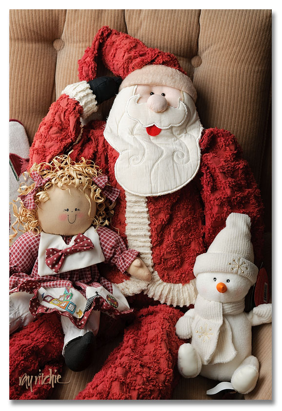
I had some trouble getting into the mood for Christmas this year, as with my mother’s death in April, many of the family traditions seem to have started slipping from our grasps. But Anita pushed me, and we did get the decorations out, the tree put up, the stockings and Moravian star hung, and all the holiday dishes put out, so it does actually look something like Christmas here now. We did our Christmas choir program last week, and repeated it for a local retirement home, and on Saturday we went to a holiday concert by the New Jersey Chamber Singers, so it’s starting to feel like Christmas, too. Last night and today I (belatedly) got our Christmas card designed and printed, something I missed doing last year due to Mom’s hospitalization. I like this year’s design, and am anxious to share it, but my tradition is that I don’t reveal the design online until at least a couple of days after the cards are mailed, so in lieu of that, for now I’ll share this photo:

These figures are frequent test subjects for me when I want to experiment with lighting techniques for portraits, as they have some of the dimensionality of a human face, and lots of fine textures that help me check my focus and processing (In the shot above, the lighting was done with a combination of natural window light and off-camera flash through a white umbrella). They’re also usually part of our holiday decoration scheme somewhere in the house; Santa and the snowman are currently sitting in the rocker in the living room.

I’ll be spending the next day or two addressing envelopes and getting the holiday newsletter printed, and then the cards should go in the mail Wednesday and Thursday – hey, the USPS still have almost 10 days to do their part! I’d never get anything done without deadlines.

In the meantime, consider this an early Christmas greeting from my family to yours.

Imagine

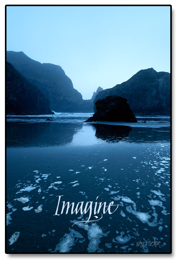
When we made our trip up the Oregon coast about a year ago, the single thing that left the most enduring image in my mind was the “seastacks.” These rocky outcroppings, unlike anything I’ve seen on the Atlantic coast of the U. S., are ancient remnants of a coastline that no longer exists; all of it except for these strange shapes has been eroded away over thousands, or even hundreds of thousands, of years. When we were staying overnight at Gold Beach, I got up very early and drove down to Meyers Creek Beach, in Pistol River State Park, to watch and photograph the seastacks in the early morning light. I was on the beach before first light, and as I walked along the wet sand dodging the incoming tide, the looming rocks were almost spooky, causing my imagination to work overtime.

Here’s one of the images from that shoot, in poster form:

Seeing that piece of shell in the foreground, I couldn’t resist giving it a little emphasis with the calligraphic flourish on the “g.” What lies beyond the rocks is left to your imagination.

Letters and Spirit

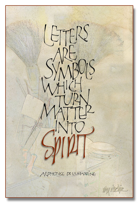
I’ve been in a production mode this week, as I’m going to a small local craft show at our church, and have been feeling that I didn’t have enough new things to show. I’m really terrible at guessing what will sell at these things, so I seem to wander in a lot of directions in my attempts to be “commercial.” The piece below probably isn’t going to be that successful for the current venue, but it’s a favorite quote for calligraphers, and I had never done it before, so once it came into my mind, I felt compelled to do it.

The letterforms of the main text should be familiar to you if you’re a follower of this blog, as they’re yet another variation of my loose modern caps, similar to those in my Beer Geek poster. I chose these forms because I feel they’re “mine” now, and different from most of the more formal treatments of this quote that I’ve seen. All the words were originally done in pencil, and then touched up on the Wacom tablet, after scanning them into Photoshop. The word “Spirit,” however, derives more from my pen and brush lettering than from the loose versal forms. The background started as a photograph, one of thousands I’ve taken over the years during various calligraphy workshops. It was turned into a sort of a sketch by a technique similar to that described in a previous post which you can see here. I then blended the photo with a scan of a very nice piece of calfskin vellum which has been sitting in my supply stores for over a year now, waiting for a project which justifies such an expensive material. I was glad I had it on hand, though, as I really love the look of the veins and the hair follicles for a piece so oriented towards calligraphy. And working in Photoshop like I was doing here, I was able to use it at no cost, as the vellum is still completely untouched. All of the letters have a small touch of shadow, to give a 3-D effect, but I deliberately gave a little more shadow to “Spirit,” to give it a sense of floating above the rest of the piece.

We’ll see whether it sells – if not, it won’t be the first time that something I have liked myself didn’t appeal to the public.

Explore

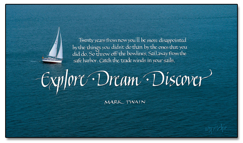
I originally created this piece about a year ago, but the quotation was set in type rather than hand calligraphy, and that never made me quite happy. Today I re-worked it with a calligraphic treatment, and I think I’m much happier with it now. This is one of those quotes that I saw somewhere, wrote down in my notebook, and never really questioned the attribution. I hope Mark Twain really said it; some Internet sources seem to cast doubt on that. I like it, anyway.

The photo was taken several years back when we were on a cruise around the British Isles  - I believe we were pulling out of Southampton harbor at the time. As usual, you can click on the image above to see a larger version.

Note for those sharp-eyed readers who may have seen the original version of this post: Yes, I did make a couple of changes. I decided that my two “D’s” in “Dream” and “Discover” were too different in shape, so I replaced one of them by a copy of the other. And after looking at the image awhile longer, I decided the word “Explore” was a little too compressed compared to the other two title words, so I did a small amount of manual kerning by sliding the letters around in Photoshop. Ah…all better now. (If you’d like to compare the two, the original can still be seen in the comments log at http://www.rritchie.com/wordpress/?attachment_id=788#comments)

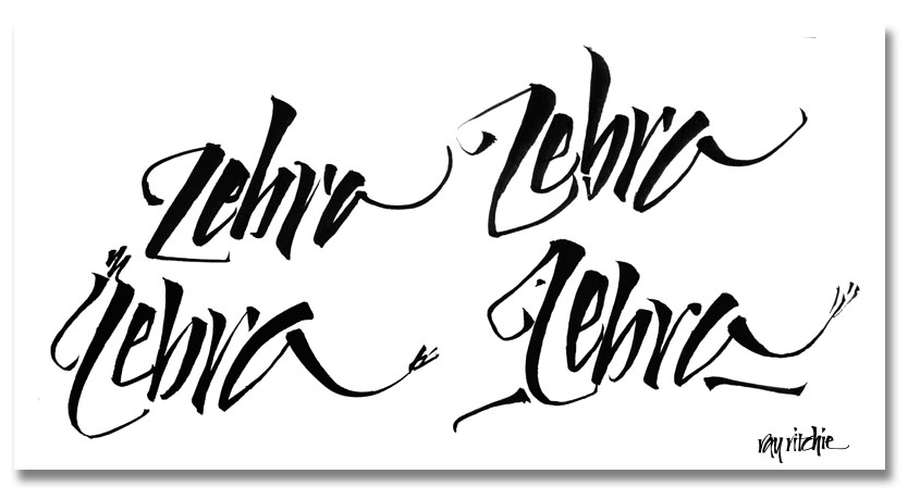
Zebras

I do a lot of calligraphic doodling while sitting in the den in front of the TV, with a lapboard and whatever tool is within arm’s reach. That tool often turns out to be my Pentel brush pen, as I really like the spring and point of that brush. These zebras popped onto my sketch pad recently, for no reason I can think of. Maybe there were some zebras on the TV screen at the time:

The technical name for this kind of design is “calligram” – a word or words written in the form of a picture, usually a picture related to the words themselves. Yet another item with no immediate application, in my case. Maybe someone out there has a cute Zebra poem?

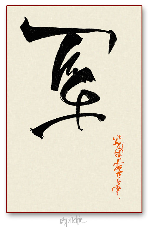
Pseudo Kanji

I have been interested in many aspects of Asian culture, and in particular, Japanese culture, for a long time. During my career in engineering, I had a lot of business dealings with Japanese companies, and had the opportunity to travel to Japan several times. Over the years, I picked up an interest in the board game of Go, and tried to teach myself some of the language. To me, the hardest aspect of the language was the writing system. Japanese uses several different alphabets, including Kanji (a set of pictograms for words derived from Chinese), Hiragana (a phonetic alphabet used for words of purely Japanese origin), Katakana (a phonetic alphabet for words of foreign origin), and occasionally, Romaji (Western Roman characters). Writing and reading Kanji, Hiragana, and Katakana are difficult because western eyes are not tuned to recognizing differences between characters, and because brush writing is a skill in itself. I do a lot of western brush calligraphy, and I do sometimes try writing certain common words in Kanji, but recently I was playing around with my brush, and decided just to create some marks that resembled Kanji, without concern for meaning. Here’s an example:

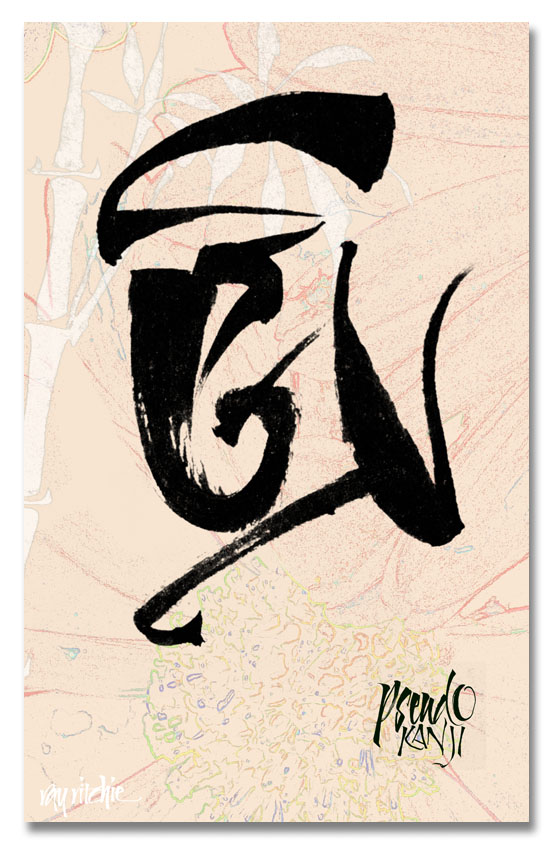
Here’s a second example, which I really did more as an exercise in creating a background texture than for the writing itself:

As far as I know, the above marks don’t actually say anything – they’re just interesting doodles. But when I do this kind of doodling, I feel like the Pogo character of Barnstable Bear, who could write, but couldn’t read, and had to have others to read it back to him before he knew what he had written. So if I have written something that offends you here, please let me know!

Fall’s Last Gasp

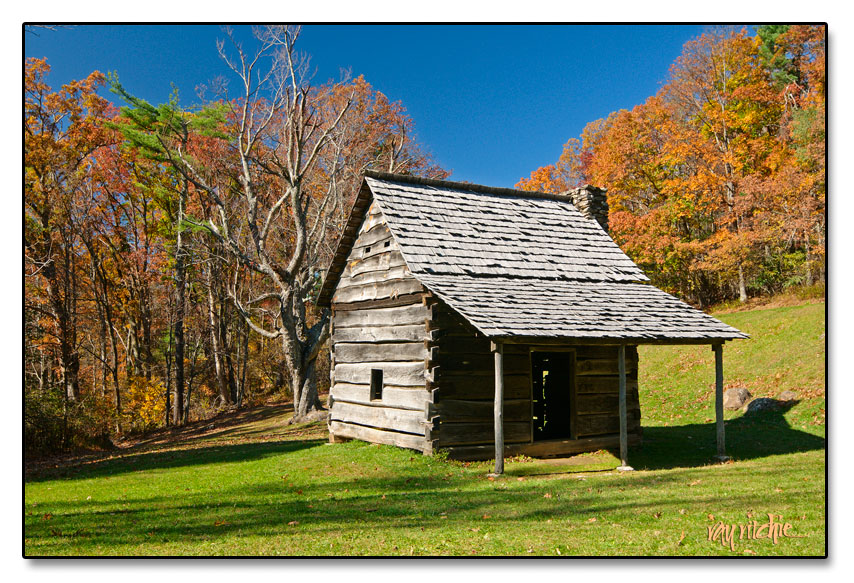
Last week we were visiting Anita’s dad in North Carolina, and we decided to take a ride on the Blue Ridge Parkway to see if there was any color left. I, of course, was hoping to find some good photo opportunities, though the other four people in the car would have been content to simply ride and look. As it turned out, the colors seemed to be about a week past peak along the Parkway, and the strong early afternoon sun and cloudless sky weren’t optimal for photos, but I was glad we went, as I really haven’t gotten to see much color this year. Here’s what I considered the best shot of the day:

We’re back home in New Jersey now, and it looks like winter will come early this year; they’re saying northwestern NJ will get snow tonight. Hopefully, I can get out soon and catch a few more images of fall’s last gasps in the central part of the state. I’m not ready to start shoveling snow yet.

Caption needed

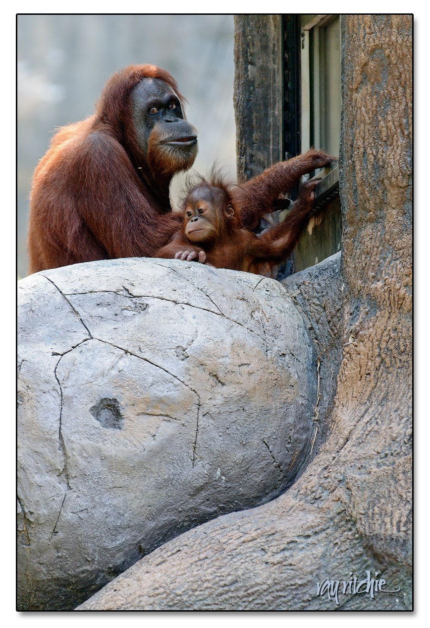
Sometimes I have photos that I love, but I don’t really know what to do with them. This one seems to have potential as a greeting card or a poster, if I can come up with the right caption:

One idea for a caption: “Maybe I really shouldn’t have posted that on Facebook…”

Here’s the backstory on the photo: We were visiting our daughter in Atlanta last August, and made a trip to one of her favorite places, the Atlanta Zoo, where they had a host of new animal babies, including the orangutan seen here. The mother really is busy at work on a computer, of sorts. It turns out that the zoo has an ongoing program to assess primate intelligence using a special-purpose touchscreen computer mounted in this artificial tree trunk. They flash a picture on the screen and then a set of touch buttons which allow the orangutans to “classify” the object in the picture as, say, animal, bird, fish, or “other.” When they get the right answer, the apes are rewarded with a treat dispensed below the screen. So this mother has assigned herself a regular work routine, sitting at the screen and taking the test for several sessions a day. I believe we were told that her answers are significantly better than just random chance, but I don’t remember the exact statistics.

Your suggestions for a caption are very welcome!

Geekletters

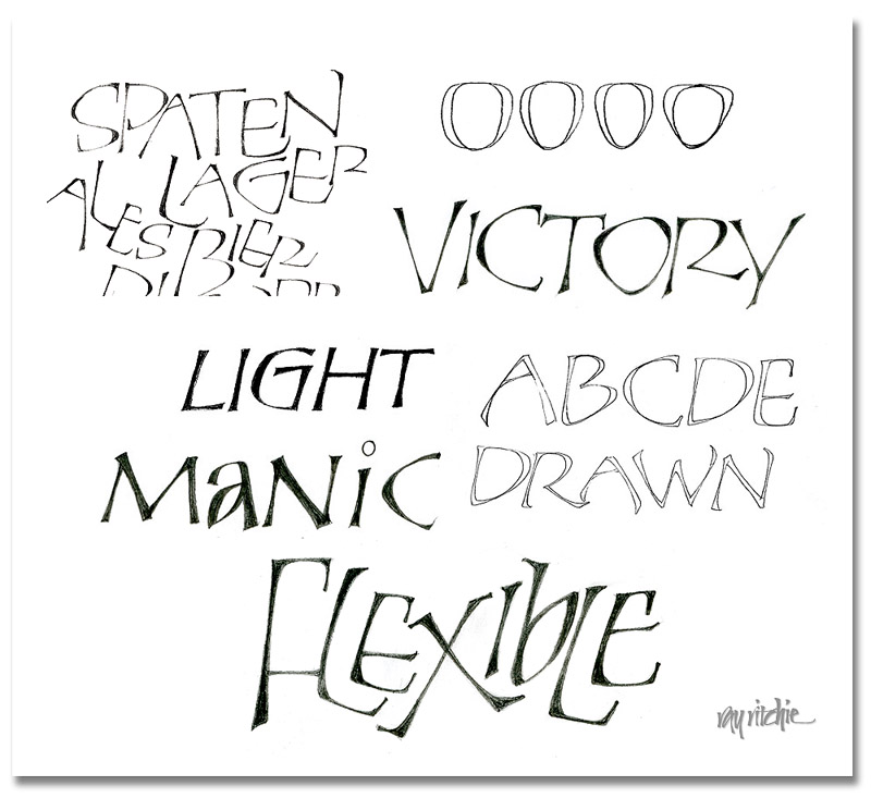
I promised to show some more examples of the Perkins-inspired letters, which we’ll call “Geekletters” for now, lacking a better word to cover a fairly broad category. Here’s a paste-up of examples from various scratch sheets that I had on my drawing board:

In the upper left, you see a crop from the original letters for the Beer Geek poster, which were first done as pressure-release monoline pencil shapes, and then were slightly retouched to add weight at various points. One of the original distinguishing characteristics of the “Perkins” caps for me was their use of a somewhat triangular shape in most of the curves. You can see this illustrated in the row of four “O” shapes at the upper right. This row progresses from a shape that is almost a classical “O” (though a little more of an “apple” shape) to a shape that is distinctly triangular. In the word “Victory,” you can see that the O, C, and the bowl of the R have taken on this triangular shape. To the left of that word, however, you see the word “Light,” in which the G still retains a more rounded (here, almost square) form.

The word “Manic” illustrates another quirk – I often mix caps and lower case forms within a word. This can give a distinctive and eye-catching quality, and breaks the monotony of seeing the same forms over and over.

The drawn nature of the letters is illustrated by the “ABCD Drawn” lines, which are an un-retouched scan of my pencil lettering. When I’m doing these sorts of letters, I often do only a fairly approximate sketch of my idea in pencil, then scan it into Photoshop, and do all the final development of the letters there, using my Wacom tablet as my pen and paper.

One of the main reasons I love pencil lettering is that it’s extremely flexible, as in the word “Flexible” above. Here you can hardly recognize any of the original Perkins origins, and yet the letters evolved from the same source as the other examples above.

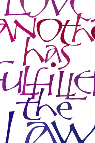
Here’s a color example, cropped from a piece based on Romans 13:8:

I’m still looking for a good name for this letter family, and would welcome your thoughts.

Pure and Simple

It seems that every time we enter a new election cycle, the public appetite for simple solutions to complicated problems increases. We hear calls for the “simple, unvarnished truth,” as though there really is someone somewhere who is sufficiently wise to discern what that might be, given all the unknowns and complications we face.

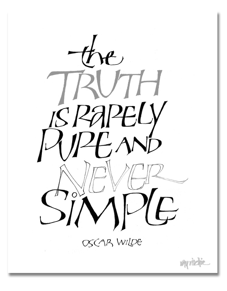
I got some queries about the lettering on the Beer Geek poster in the previous post, and I thought I should do some further posts about that style of lettering. As I was thinking about that, and as I was reading the latest reports of the political posturing going on across the country, I was reminded of this quote:

I started doing letters like this a number of years ago; I usually think of them as “Perkins Caps,” because I originally started doing them after seeing some work by Tom Perkins. I really haven’t studied Tom’s work for years now, though, and my forms have continued to evolve, so I need to think of a new name for them, and stop blaming Tom for something for which he should bear no responsibility. Maybe I should call them “Geek.”

The letters above are a heavier-weight form related to the letters of the previous post. They are a drawn and filled form. They start out for me as pencil outlines – you can see an example above in the word “Never.” I usually outline with a fairly hard pencil, such as a 3H or 4H, and then fill them in with something like a B or softer. Doing this kind of lettering is a slow, deliberate process, much like doing any other kind of pencil drawing, but it allows great control over the forms, and lots of flexibility, since you’re constrained only by your imagination. I’ll show a number of variations in the next post.